In our previous blog post on developing the next genertion of BlobbleWrite fonts we explained how we developed the BlobbleWrite Circle and Line font. Using only a single circle and lines we were able to create small computer programs to automatically draw each letter path. This gives us a font that contains not only the final letter forms but also the strokes required to create them.
In this blog post we are going to look at how we use the flexibility in this approach to evolve the circle and line font into an update for our BlobbleWrite Basics font in the BlobbleWrite app. Our goal in designing the BlobbleWrite Basics font is to create the best font for children learning to write the alphabet.
Each letter is created using a small computer program to 'draw' the stroke that represents the letter. Each program has a certain amount of built in flexibility to allow us to adjust certain visual characteristics of the letter form. For instance, we can vary the width of the letter relative to its height to give a letter a narrower look. We have built in several possible adjustments to each letter program to give us the flexibility to tweak our fonts efficiently. This opens up the possibility of providing multiple fonts much more easily and possibly allowing users to create their own font style that fits with the way they teach handwriting (BlobbleWrite FontStudio?).
So let's take a look at the letter 'a' from the BlobbleWrite Circle and Line font and see how we can use the flexibility we have programmed to evolve to a letter form that we can use in the BlobbleWrite Basics font.
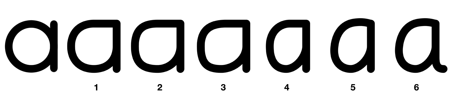
The above diagram shows the steps we took to achieve this transformation.
1 - Move the stroke start to the top right hand corner of the loop
2 - Square out the edges of the letter
3 - Tilt the loop slightly to the right to give a more natural flow
4 - Make the loop body narrower
5 - Add a slight upward movement at the start of the stroke
6 - Add a tail to the end of the stroke
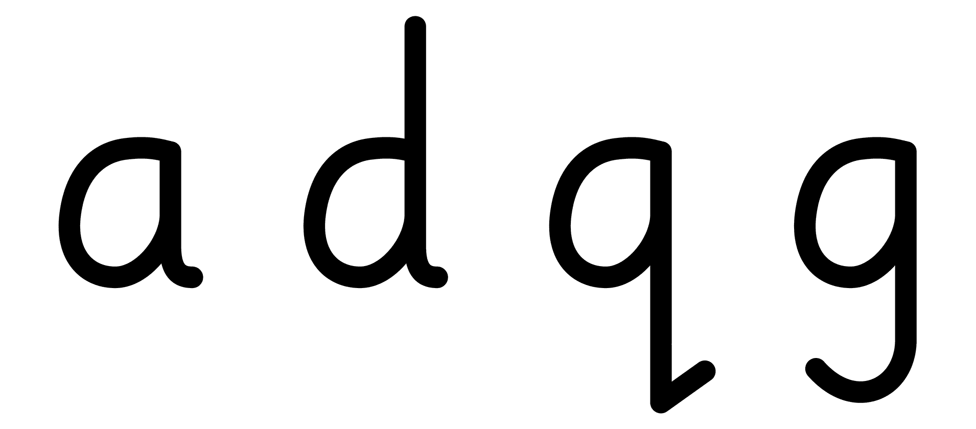
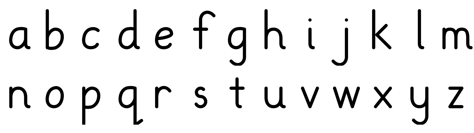
We can then take this stroke path and reuse it in the other letter forms for 'd', 'g' and 'q'.
If we rotate the loop by 180 degrees anti-clockwise we can use it in the 'b' stroke and reuse it again in the 'p' stroke. Similarly the 'n' up and over stroke is used in the 'm', 'h' and 'r'.
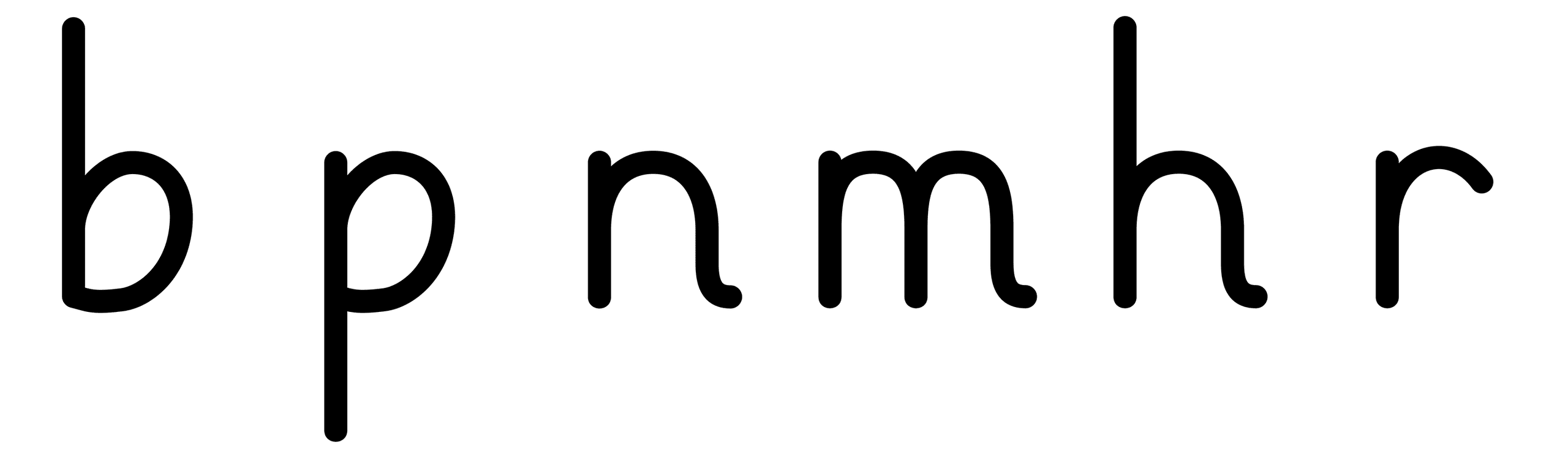
By re-using these sub-strokes across letters we end up with a font that is highly self-consistent and by extension easier to learn. This makes it an ideal font for learning to write with. We also have the flexibility to make adjustments and add features quite easily in future.
This font is ready to be used in the BlobbleWrite app immediately - not only do we have the letter shapes but also the stroke information required to create them.
In the next blog post in this series we will look at how we can take this font even further and adapt it to create a cursive version.